Tuesday, October 21, 2008
ARCH1142 REFLECTION
I really enjoyed the method of working in a cyclical workshop, choosing three workshops and rotating every four weeks after creating a final project from each workshop. It allowed me to experience different aspects of the workshops, and use the strategies and methods learnt from the previous workshops, and applying them to the subsequent workshop.
In each of the workshops that I undertook, I learnt different approaches in communicating my thoughts and ideas. As Ainslie Murray emphasised in her lectures, the three most important ideas in Architecture are precision, spatiality and fluidity. I believe that through these workshops, I have gained more knowledge and understanding of these three ideas as they were actually put to practise in the execution of our final projects.
In relation to these three factors, precision was most evidently learnt from the Material Modelling and Drawing workshops. In Architecture, one of the most important skills is precision. Models and drawings must be executed with high-level precision, which I gained more practise through these workshops.
In contrast, the Fluid workshop was much different to the other two workshops, as it was more concerned with spatiality and fluidity. It focused on communicating expressively through the medium of charcoal, leaving behind the details and looking at a larger scale in respect to space and volume. Like its name, this workshop concentrated on creating works so that we were able to express drawings fluidly through light and dark tones.
Architectural Communications has significantly helped me to gain and experience new skills, while developing my current skills and extending my knowledge. Communications is an inevitable skill in Architecture, where one needs to vividly and fluidly express their ideas and concepts through means of an individual’s developed language. And, this subject has helped me to shape my own language in communicating my thoughts and processes.
All in all, I have thoroughly and enthusiastically enjoyed learning and working in each workshop, experimenting with different techniques, ideas and materials, and producing final projects that I am very pleased with. It has been a very exciting, interesting and yet an intense course.
MATERIAL MODELLING WORKSHOP
FINAL PROJECT PRESENTATION
TRANSFORMATIVE ACTIONS MODEL
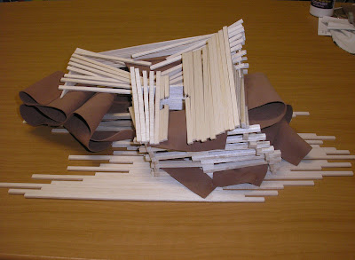
The two transformative actions that I chose were: linear distortion and continuous folding.
The continuous folding action complemented the linear distorion action well. The continuous surfaces of the folds connected the fragmented pieces formed by the linear distortion to form one component.
The flexibility of the foam rubber/ latex material allowed me to control the continuous folds by creating curves, while also making sure that they were not randomly folded.
The main aim of this model was to express creativity through conceptual and abstract ideas, while making the building still habitable.
The model gives an illusion of a volcanic magma oozing out of the house as firm pressure is applied to the top of the building. I slanted the height of the house so that it decreased in height as it came to the frontmost corner, distorting the building's shape while allowing the continuous folds to flow from inside the distorted parts.
PROCESS WORK

I made the flooring of the house to reflect the distorted linearity of the house itself by glueing the thin balsa strips in different lengths to create parallel lines that run across the base of the house.
1:50 SECTIONAL MODEL
This is my 1:50 sectional model of half of my house made from boxboard. The model demonstrates the exact wall thicknesses and form of the house.
IN-CLASS EXERCISES
THE "PERFECT" CUBES
The first class exercise was to make 80 x 80 x 80mm 'perfect' cubes with 2 methods:
1. individual cut-out pieces
2. scored cut
REPLICATED OBJECT: KNIFE
This group exercise consisted of making a replicated object in boxboard. We chose to replicate a knife cutter. We also replicated its functionality by making the blade of the knife to be retractrable.

Wednesday, September 17, 2008
FLUID THOUGHTS TO ACTIONS WORKSHOP - FINAL PROJECTS
FINAL PROJECT PRESENTATION
CONCERTINA PRESENTATION

SYDNEY OPERA HOUSE DRAWINGS
The first drawing was made at the Sydney Opera House where the main idea was to capture the spatial qualities and the volume of the building, rather than focusing on the structural and detail elements of the building. We were to avoid drawing the familiar versions of the iconic building. Thus, as a rule, only 10-20% of the sky could be visible in our drawings. Using willow charcoal, I portrayed the form and space of the building, and incorporating the use of light and dark tones to emphasise the surfaces' varying tones.
The second drawing also made at the Sydney Opera House was to highlight the transitional changes in time and see what is past and what is present. By moving to three different locations after every 10 minutes, we were to draw the different views over the same drawing. Thus, through overlapping and a certain degree of transparency, it allowed the drawing to depict the interpentration of forms.
LANDSCAPE DRAWING
For this drawing, we had to draw the landscape we could see outside by looking out through the window from the Level 6, Red Centre building. Once we drew the landscape, we had to pick a certain element to amplify and draw on top of the drawing. Here, I picked out the arched posts surrounding the oval, and overlapped it on top of the landscape drawing. These ampliefied posts create an almost window-like frames that open up to the landscape that can be viewed as different parts, although they are still one whole.
STILL LIFE DRAWING
This still life drawing was quite different to the usual still life drawings as the postion of the subject matter constantly moved every now and then. Similar to the Sydney Opera House drawings, this drawing once again focused on capturing the transitional elements of the past and present. Thus, every time the objects were moved, we continued on drawing the new view on top of the previous drawings, creating a track in time that represents a flowing movement. Capturing the tones of the still life objects were very important, emphasising the dark areas, while highlighting the subtle and light parts.
COLLABORATIVE WORK 1 - DESCRIPTION DRAWING
For the first collaborative work, each member of the group was sent only a written or verbal description that described a non-existing space. After reading the description that I had received, I had to translate the space into a drawing and communicate the elements described by the other member. I wanted to keep the description alive by reflecting the exact description while also extending the description to my own personal and creative level, introducing and shifting elements that still connected with the original description.
Description:
You’re in a space and you are looking through this door. The door is open but it isn’t visible in the picture. There is a bag sitting in the hallway with a ball near the farther end that is rolling towards the bag. There are two huge rectangular windows where the vertical side is much longer than the horizontal side. The space you are in now is dim in colour, dark blue with shadows, and you are looking into a brighter space where the sunlight is coming in.
WHOLE CLASS' FINAL PRESENTATION
Just a photo of the whole class' final project presentation - looks absolutely awesome :)
GROUP COLLABORATION PROJECTS
THE EXQUISITE CORPSE
This group collaboration work consisted of each group member producing an A2 drawing, then capturing an A4 section of the drawing and sending it to the next group member. The subsequent group member had to continue on from the A4 section image that they had received. We ended up with four completely different drawings that had undergone a significant change from the first drawing we had started off with.
With a main focus on still life subject matters, we tore up our drawings into many parts to create a large collage derived from our four individual drawings, reflecting the Cubist style. In the bottom part of the artwork, the objects are recognisable and as it is delved further back towards the top of the work, objects are distorted in shape, shattered into little bits and pieces where objects are no longer recognisable in form. Thus, the work portrays a fluid transition in form. The work also illustrates a subtle 3D effect where the objects (cups, books, lamps, etc.) were slipped inside slots cut on the work. This gives a popping-out effect. Overall, the abstract work intertwines with each other through the drapery and plant-like stalks that threads through the work, forming one unity.
THE WALL
This is another group collaboration work where we depicted a wall, highlighting the spatial qualities that it formed. Through the repetition of the long, linear windonws, we connected all the drawings together by continuing the linearity of the windows in each drawing. We also concentrated on the light and dark tones of the walls created by the sunlight pentrating through the windows.
Thursday, August 21, 2008
DRAWING WORKSHOP - FINAL PROJECT
MARIO BOTTA'S RIVA SAN VITALE
.JPG)
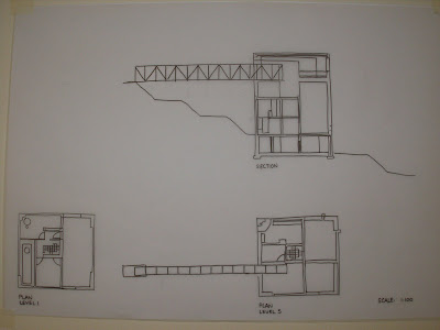
Botta's house places a strong focus on its dense, block-like form and rigid structure. Especially with its truss bridge forming part of the building, it accentuates the structural elements of the building. The dense, bold line weight used in the technical drawing illustrates the heavy solidity of the building.
The drawing is arranged in a logical manner with the building's plans located on the bottom part of the sheet, projecting up to its elevation, and moving straight across to the upper right of the sheet showing the building's section.
3D PERSPECTIVE DRAWING
.JPG)
.JPG)
The 3D perspective drawing focuses on the different viewpoints and perspectives of the building, exemplifying the different elements and features that compose this building. The building places a strong emphasis on its linearity, creating strong visual lines. Thus, the 3D drawing depicts these strong perspectives, illustrated in almost a sequence-like story. Through ongoing exploration of the Botta house, I was able to draw a similarity between this building and Tadao Ando's "The Church of the Light". Since this building is located in Switzerland, obviously it is out of my reach to view the building in real life, thus it may not really be similar to Ando's Church. However, the specific openings on the walls give me the impression of the cross opening on the wall of Ando's Church. Through these openings on the wall, light and darkness plays an important role in both buildings, creating a significant atmosphere as the opening controls the way light is entered through the wall. Thus, the 3D drawing also highlights the stark contrasts between light and dark.


.JPG)
.JPG)

.JPG)